President Graph – FRED Data Broken Down by Party and President
by Malte Skarupke
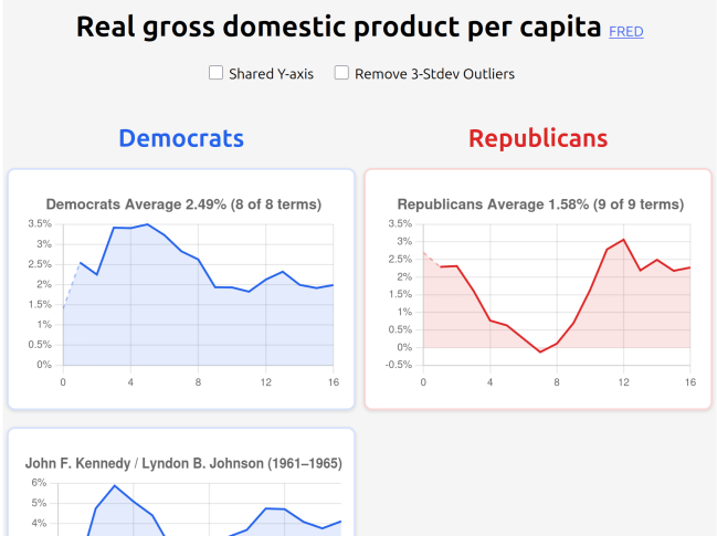
I made a website to explore FRED data broken down by US president and party. This is obviously motivated by the current president. During the last election I was frustrated by how many nonsense arguments there were being made. Like people voting for republicans because they were hoping for a good economy. This seemed exactly backwards in my mind because in my lifetime there was a repeated pattern of republicans messing up the economy followed by democrats cleaning up. But I’m really not good at having arguments with people, so I’d rather let the data do the talking.
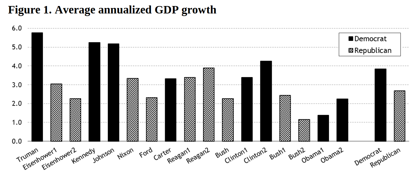
There is a series of papers that explore the relationship of presidents to GDP, and I have wanted to dig into that data before, and also try other metrics.
But how do you do a fair comparison of the two parties? In a way that works for any metric that you can think of? My first thoughts were all way too complicated and a simple averaging of line graphs was what won out. I’m even ignoring that e.g. Obama was in office for eight years vs Biden for four years. These count as three separate terms. In the end the graph didn’t look like I expected, but it still clearly shows higher GDP growth during democrat presidencies.
Included Data
I’m showing data going back to 1961. Mainly because I don’t know anything about the presidents before that, Eisenhower and Truman. At some point you’re going back so far that the parties just feel different from how they’re now. But JFK wouldn’t feel out of place with current democrats, and Nixon wouldn’t feel out of place with current republicans, so I went back to them. Importantly I did not do this to mess with the data. In fact the Truman and Eisenhower presidencies start off the trend in the Hoover Institute paper linked above:
I also worried that I might be biased because of my lived experience, and if I had stopped too late, at say George H.W. Bush, then maybe I just picked some unlucky presidencies for republicans and lucky presidencies for democrats. By going further back there is more of a balance, including some bad times for democrats, like when inflation and crime peaked under Carter, and good times for republicans under Reagan.
Oh I also added crime data because that’s a big thing that people vote for. I’m open to adding more data sources if I forgot something important that’s easy to add. I thought crime would be better for republicans, but actually it looks better for democrats. Part of it is republicans being in power during the crime wave of the seventies and eighties, but even if you cut the data off in 2000, murder generally went up under republicans and down under democrats.
Fair Comparisons
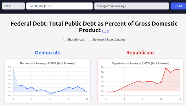
I tried picking some honest series as examples. E.g. I picked the budget surplus/deficit series because it reflects decisions that people made intentionally. You could argue that the number that really matters is “debt as percent of GDP” and specifically how much that changes each year. That number looks great for democrats. But the reason it looks good for Biden is that inflation was high, so it’s unintentionally good. You don’t want to vote based on that.
I’m sure someone will want to make an argument that this graph should count, but for the examples on the main page I wanted to choose graphs where the numbers are less ambiguous. And you do have the ability to pull in any series from the FRED if you want more.
Lagged graphs
When does a president really start to have an impact? Clearly not on day 1, because it takes a while for policies to have an effect. But actually if you look at the trade deficit graph for Biden, it goes very negative in the last month. Why? Because people were importing lots of things to front run Trump’s tariffs. So maybe the lame duck period should count towards the new president already, resulting in a lag of -1 or -2? The simplest and fairest thing is to start at the inauguration. Then people can look at this graph and come up with the story that explains it. One of the papers above found that if you lag all graphs by 18 months then the two parties look almost equal in quality. (you can make up your own mind on whether that’s fair, and whether e.g. the current high oil prices should be blamed on Biden)
Vibe Coding
This is my second big vibe-coded project. It once again turned out much better than I could have achieved on my own, especially in the limited time. I’d guess that 98% of the code is written by AI. I only went in to make small edits.
E.g. just before writing this blog post I wanted to add the “Trade Deficit” graph but it requires using every single feature of the FRED:
- Splicing together multiple series
- Where one is in billions, and one is in millions, so you have to divide one by 1000
- And one is quarterly and one is monthly, so you have to sum three months to get one quarter
- And you really want to adjust for GDP to take into account inflation and a growing economy, so you need to divide one series by another
Up to this point I had gotten by with just simple line drawing. Did I really want to risk adding all these features on a project that was almost ready to publish? I decided to ask the AI and it wrote a new system to combine graphs in ten minutes. Then a few more iterations to allow editing things on the website (not polished) and it’s done. With more features than I would have written on my own.
Once again I appreciate how easy it is to polish things. When I notice that something is off, I just ask the AI to look into it. So many little improvements happen when they’re just a little question, instead of potentially hours of my time. I am still considering polishing the UI for composites. After all it doesn’t hurt much to ask… (but in practice there are too many things to do, like writing this blog posts, and finding more good examples for the front page, and I added lagged graphs after writing this sentence, too…)
Congress – the Main Idea that Didn’t Make it
It would be nice to have economic indicators broken down by which party has the majority in congress. Or maybe do the breakdown by which party has governors in more states, as one of the linked papers above does. But I have not yet had an idea to get simple visuals for that.
Who is this for?
So who is the target audience? It’s for people who understand FRED graphs and want to have a simple visualization to share with a wider audience. You can set up a visualization that you think proves a point, and then create a shareable link that allows others to look at the same data. (and e.g. see how robust your conclusions are to lag, or to changing some property on the data series) I’m hoping this visualization makes for a simpler story than a FRED series does, without distorting things too much.
Try it out, let me know what you think.

If all you do is calculate simple averages, then you invite criticisms of your work as well. For instance, there is a limited sample of post-WW2 recessions. What if the timing of recessions is that it just happens to fall more during one party than another? Do you account for that? Do you account for how the behavior of the unemployment rate can differ significantly over the course of the business cycle? Should Republicans be blamed for the COVID recession when there were recessions everywhere? Or any of other nuances to the US economy?
Anyone who knows a little econometrics knows that the problem is identification. How do you identify what policies from Presidents of each party are responsible for growth, or lack thereof? Turns out, that is kind of hard. Presidents (and Congresses) do lots of things and figuring out their connection to growth isn’t easy. That’s why there’s debates about the size of fiscal multipliers.
– I think the point about “identification is hard because presidents and congress do lots of things” is a point in favor of averaging, no? Sure, averaging makes it hard to know which policy exactly to do next time, but it makes it possible to figure out which party got more things right on average in the past.
– The first linked paper talks about timing of shocks and comes to the conclusion that roughly half of the difference between the parties is due to “good luck”.
– I personally think that if person A keeps on getting unlucky somehow, not just two or three times but repeatedly, and person B keeps on getting lucky, then person B is probably better at their job (and same for group A vs group B). Luck is when opportunity meets preparation.
– I was here during COVID and republicans definitely take a lot of blame for it. They literally disbanded the pandemic preparedness team and made it illegal for labs to run their own tests. I’m not going to rehash the whole history but we were already set up for bad luck before March 2020. It’s also not true that there were recessions everywhere. Taiwan was well prepared and handled COVID well. Could the US have done as well as Taiwan? Difficult. Did we need to do as badly as we did? No. If you just do a few percent better by not doing the big screwups, that adds up to a lot better over time.
– Still in order to be fair I added the “Remove 3-stdev outliers” checkbox. If you check it, democrats’ average real GDP growth shrinks slightly to 2.47% and republicans’ average real GDP growth improves slightly to 1.66%. So not enough to change the overall conclusion. The checkbox does however change the “Inflation” graph to look better for democrats. That was one of the few graphs that looked better for republicans, so if you take that away there really isn’t much left where republicans look good.
[deleted by Malte Skarupke – I don’t want flamewars in my comments. Polite disagreements are fine. This comment was not as bad as your other one, but I don’t want to figure out exactly where to draw the line. Since one of your two comments was clearly over the line, I decided to delete both]
I never argued that Republicans were better than Democrats. I argued that actually trying to answer that question in any kind of sensible way is very difficult.
The COVID point is misleading. The economic impact of COVID was global. So it’s not just a US story. How did US do relative to other countries?
As I said in the article, I’m not good at having arguments with people. I probably shouldn’t talk about specific situations like this. This particular question seems even more difficult than the open question of how to draw graphs to compare the performance of congress. Others have tried anyway, this one focusing on mortality (not good), this one focusing more on economic data (good, but you won’t like who they credit with the investment boom), but they also conveniently forget to mention that this was bought with a increase of 20% to the debt/GDP ratio. Is that good? Maybe? How do you compare that to e.g. Germany who only increased their debt/GDP by 10% but had less growth? Just say they had different priorities? I don’t even know what a reasonable performance is for a 20% debt/GDP increase. Is it good that we’re back at the pre-pandemic trend? It feels really important to also look at the costs when looking at the gains, but the article just doesn’t… (I didn’t look at more results from that google search, maybe others did a better job)
But also, as I’m making that comparison, it feels like I’m comparing two Shackleton expeditions while ignoring Amundsen, so it kinda feels like the wrong conversation to have…
[deleted by Malte Skarupke – I don’t want flamewars in my comments. Disagreements are fine but this was unnecessarily flame-y]