Where do top scientists come from? And what do taxes have to do with it?
by Malte Skarupke
I was reading this article recently, which talks about “Where star scientists choose to locate: the impact of US state taxes” It’s a summary of a paper about “the effect of state taxes on the geographical location of top earners.”
It’s a very interesting idea: The problem is that states often lower taxes with the hope of attracting business or talent, but there is very little evidence about whether that actually works. So the authors of that paper decided to find a group of influential people who are somewhat easy to track: people who apply for lots of patents, the so called “star scientists” from the title. So the authors built a huge database, tracking where the top 5% of scientists who applied for the most patents had moved to over the years.
And the authors claim that they found pretty clear evidence that people like to move from high-tax states to low-tax states, so the conclusion is that if you want to attract top scientists, you should lower taxes.
Except, I dug through the data and I found the opposite. Yes, top scientists do move to states that have lower taxes, but high tax states have such a large lead in the number of scientists, that that little bit of migration doesn’t matter. But we’ll have to get to that conclusion one step at a time.
First some doubt: The “lower taxes attract business and talent” argument is clearly true at some point: If in one state you had to pay 90% taxes and in another 10% taxes, of course you’d move to the state where you have to pay 10% taxes. But if in one state you’d have to pay 35% and in the other you’d have to pay 32%, would you really decide based on that? Or would you decide based on something else, like the price of real estate, the quality of life, quality of schools or quality of the work that you’d be doing?
Reading the above article, there are a few reasons to be suspicious: The top two hacker news comments about the article point out two big mistakes: 1. The authors ignore sales tax. 2. The authors didn’t measure where people choose to locate, they measured where people migrate. Which is a subtle but very important difference.
The other reason to be suspicious is that the article reminded me of this piece, which talks about the “Rich states, poor states” index by a conservative think tank. In that index the authors find a bunch of indicators that allow them to claim that states that tax highly are not doing well and states that have low taxes are doing great. For example they claim that New York and California have been doing terribly for the last ten years, because lots of people are moving away from those states. They apparently never paused to think that if New York and California are doing terribly in an index called “Rich states, poor states”, you probably have it exactly backwards…
So when I saw that same measure of “migration” being used again to claim that states with low taxes attract lots of scientists, I became suspicious…
But I do have to say one very positive thing about the authors: They made their data available. Unfortunately the paper is behind a paywall, but the data is available for download for free. So I looked at the data.
A first look at the data
One thing I’ll say at the beginning is that for some reason the authors’ data seems to go wonky somewhere around the year 2003. At that point the number of scientists takes a downward turn in all states until it approaches zero in the year 2009. I don’t know why that is. Maybe something in the way they collected the data. Because of that I chose to put the end point for all my analysis at the year 2003.
With that out of the way, let’s plot where all the scientists were in 1977:

OK in 1977 California had the most scientists, followed by New Jersey, New York, Illinois and Pennsylvania. I was very surprised to see New Jersey up there. I don’t think of it as a center of science these days. But I did expect California and New York to be up high.
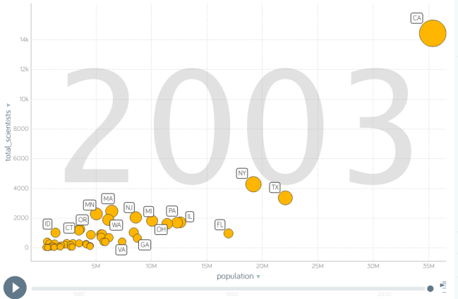
Now for comparison here is the same graph for 2003:

In 2003 California completely dominates. It has by far the most scientists. New York is a distant second, followed by Texas.
So obviously the big story over the observed time period is the rise of Silicon Valley in California. This is our first indication that something is not right about the story of scientists moving to low-tax states. California is not exactly known for having low taxes, and seeing how most of the growth happened in California, where did scientists move to low-tax states? Sure there are lots more scientists in Texas and Washington, but then we also saw healthy growth in New York, another high-tax state.
So what did they actually claim in the article? Their main claim is:
Our empirical analysis uncovers large effects of personal and business taxes on star scientists’ migration patterns. The probability of moving from an origin state to a destination state increases when the ‘net-of-tax rate’ (after-tax income) in the latter increases relative to the former.
And they use these plots to back that claim up:

The description in the article reads “Each panel plots out-migration (measured as the log of the ratio of out-migrants to non-movers) against the net-of-tax rate (which is simply one minus the tax rate, thereby representing the share of a dollar’s income that is retained after taxes). The data underlying the figures represent changes in out-migration and changes in net-of-tax rates relative to their average levels over 1977-2000.”
Now I have looked at these graphs for quite a while, and I can honestly say that I have no idea what they mean. The first thing they do is measure out-migration by measuring how many scientists move, compared to how many stay, and then they take the log of that. Why the log? I have no idea, but it makes the y-axis completely unreadable. They also claim to have taken the log of the net-of-tax-rate, but if you take the log of something and arrive at 0.02, that means that the original value was greater than 1. How can the net-of-tax-rate be greater than 1? There are no states with negative tax rates. So I have no idea what the x-axis is either… I tried looking at the outliers to see if I could identify them by looking at the data. Surely California has to be an outlier on one of these graphs. But I honestly don’t know which one it is. Also there is only something like 40 dots. Shouldn’t there be one per state? What are these dots?
They make one other big claim in the article, which is that when you lower taxes, scientists will come to your state:
if after-tax income in a state increases by 1% due to a cut in personal income taxes, the stock of scientists in the state experiences a percentage increase of 0.4% per year until relative taxes change again.
[…]
when we focus on the timing of the effects, we find that changes in mobility follow changes in taxes, rather than preceding them. The effect on mobility tends to grow over time, presumably because it takes time for firms and workers to relocate.
In a sense this claim is even more important than the first one, because it gives us actionable advice: Lower taxes and you will get top scientists. Because of the paywall I don’t have access to the paper behind this article, but the appendix for the paper is available. Luckily the appendix contains a graph that backs up this claim:

So what this displays is that at the time of the red line the taxes decreased, and the number of scientists went up. (or the taxes increased and the number of scientists went down. Both of those events would make the line go up)
These are pretty strong effects. They claim that if you lower your taxes, you will get, on average, 100 star scientists coming into your state over the next ten years. I’m a bit worried about the size of the whiskers on those plots, but the measured effect is so big that I’m inclined to believe them. (also you would expect states to promote the fact that they lowered taxes, so you would expect business to move there)
So the first graph didn’t make sense to me, but this second one does. Before I investigate this claim though, I want to make a detour, because
Seriously, this data is so cool
I mean really, somebody did the work of tracking the population and movement of scientists over several decades, and they make all that data available. How can you not just want to dig in?
The first question that my graph from 2003 above throws up is this: Sure, California has a lot of scientists, but California is also the biggest state. Number 2 and 3 are New York and Texas, which are also the two next biggest states. So isn’t this just “states with a high population have lots of scientists”? I visualized that relationship in Gapminder, but I can’t embed custom HTML in this blog, so here is a picture:
So that’s a pretty clear relationship: The smaller your population, the fewer scientists you have. Sure, Florida is punching a bit under its weight and Massachusetts is punching above its weight, but overall there is a very clear trend here: If you’re further to the right, you tend to be higher up. And in the corner we see the giant outlier that is California. If you were to draw a trend-line through all other states, California would be way above it.
What if we account for this population/scientist correlation, and instead of drawing total number of star scientists, we draw number of scientists per million inhabitants?
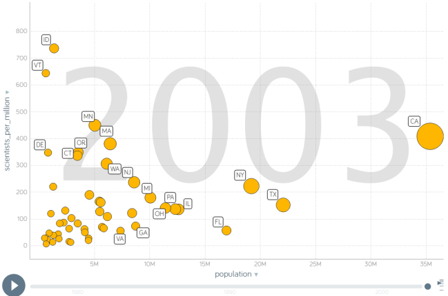
Now we see which states are really doing a good job at this science thing: Idaho actually had a huge number of star scientists in 2003 relative to its population. It had 1004 star scientists for a population of 1.36 million, giving it more than 700 star scientists per million inhabitants. California is still clearly above average, but New York and Texas now look less impressive. They’re still doing good, but plenty of other states are doing better.
But I’m now convinced that this number is the right choice for the Y-axis. We need to remove the effect that the population has on the number of scientists. If we do that we can see which states are doing a good job or a bad job. With that, let’s try plotting the number of scientists against the taxes.

On the x axis I have the average income tax that somebody in the top 1% had to pay in that state. Why the top 1%? Because that’s what the paper chose to do. Their reasoning is that top scientists are more likely to be in the top 1%. In their own data, they found that 14% of the top scientists are in the top 1% in terms of income. Should we therefore use the tax rate that the top 1% has to pay? It’s not clearly the right choice, but it’s also not clearly wrong. If you’re going to make a choice of moving somewhere based on taxes, is it plausible that you’d look at the top tax rate? I think it is. Also one nice thing of using the tax rate for the 1% is that the difference in taxes is bigger there. (for reference: To be in the top 1% you had to make more than $380,000 in the year 2011. (the last year that they have data for) Apparently 14% of star scientists make that much money)
In any case if we sort these by tax rate, we see that a lot of states with high taxes are punching above their weight. Idaho, Vermont, Minnesota and California all have a lot of scientists relative to their population. In the low tax states we see that Washington state is doing pretty well. But overall there seems to be an upward trend here.
Ah, I hear your objection: I’m not looking at the sales tax here. Sure, Washington and Texas have no income tax, but they get a lot of their income from the sales tax. So what happens if we factor in the sales tax?
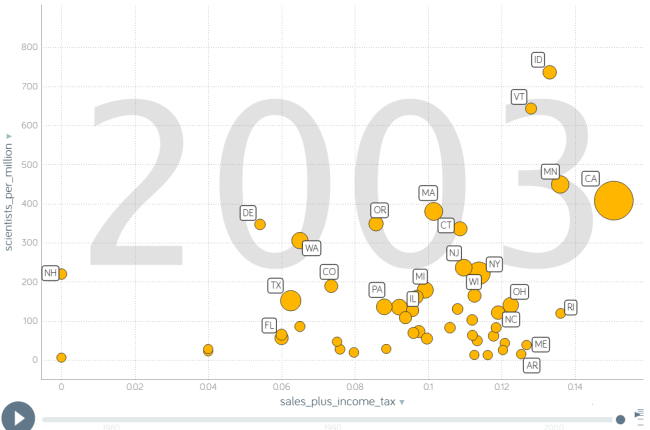
I added the sales tax to the income tax. That seems like a good approximation of what actually happens. When I do that the upward trend becomes even clearer. Washington is not as big of an outlier anymore.
I should mention that there are a few problems with this graph: The choice of using the income tax of the top 1% is now more questionable, because it exaggerates the size of the income tax relative to the sales tax. Also the sales tax is actually too small here because many cities have sales tax on top of that: Seattle, New York City, Houston, Austin, San Antonio and others have sales taxes on top of the state sales tax. But to be consistent with the original paper I chose to just use the same numbers.
At this point I would say that there is a correlation between having high taxes and having lots of scientists. Clearly just having high taxes is not enough. Look at Arkansas and Maine down there: High taxes but no science. Also I should say that this is still an approximation. New Hampshire is still listed as 0 taxes on the left, because it has no income and no sales tax. But clearly New Hampshire has to have some taxes. I just don’t have the numbers for that because I only have the data that the original authors collected. (or maybe they have the total tax numbers somewhere, but I don’t know what all their numbers mean) But with all these caveats out of the way, it is clear that the states with lots of scientists tend to have lots of taxes.
Now could this be a fluke because Idaho and Vermont are very small states, and there tend to be more outliers in small samples? Let’s find out by plotting the number of scientists again, as opposed to the number of scientists per million inhabitants:

Now California is our big outlier again, but even without it I still think there is a slight upward trend. Clearly we still have the high-tax-no-scientists states at the bottom right, but if you read from top to bottom, you get California, New York, Texas, Massachusetts and Minnesota as the top 5. Four out of five have high taxes, and Texas has a large population.
How did we get to this?
So now we know what the situation is at the end of the capture. But that doesn’t disprove the paper: It could still be that these states got all their scientists when they had lower taxes, and that the states have since raised the taxes.
That is actually the main reason why I did the work of adding the data to Gapminder: In Gapminder it’s very easy to find out which came first: Did the number of scientists go up first, or did the taxes go up first? Here is what that last graph looks like animated:

Watch this a couple times and see what you notice. It’s very noisy movement at first, but after a while you start to see patterns.
The first big pattern is that taxes used to be lower on average. Most states moved to the right. New York is unusual in that it moved to the left. The second pattern is that in the 90s, science went up pretty much across the board. It seems like there is more movement on the right side of the graph than on the left, but not by much.
To try to figure out the question of “does lowering taxes attract scientists,” let’s look at a couple of the big movers: California, Texas and Washington moved right before they moved up. New York moved left before it moved up. Massachusetts and Minnesota seem to walk left and right, but mostly stay in place while they go up. New Jersey moved to the right and down. The trends are ambiguous. This is weird because this is the graph where we should see the “if you lower taxes, you will get on average 100 scientists, if you raise taxes you will lose on average 100 scientists” result from the appendix of the paper that I posted above. A result that strong should be pretty clear, but the data is ambiguous at best, and maybe even points in the other direction.
Let’s look at the graph again where we measure scientists per million inhabitants:
In this one we can see the smaller states that are doing well again. Idaho and Vermont got lots of scientists in the 90s. That was buried in the graph above because these are small states. Both of these states moved to the right before moving up. On the other side we see Delaware which moved to the left, then hops up and down a bit but generally seems to move up.
So overall there is just no clear trend that would say that you lose scientists if you raise taxes and you gain scientists if you lower taxes. So what happened here? This is probably the most important claim from the article, and it should have been very clear, but it’s just not there.
The answer is in the number that they chose for their “Number of Stars Before and After Tax Change Event” graph: They chose the total income tax, not just the state income tax. Let me show you what it looks like when we plot the total income tax:

This looks pretty funny because all the dots are moving around together. Why? Because the total income tax is dominated by the federal income tax. Any time that the federal income tax went up or down, all the points move left or right.
With that knowledge we can explain the finding of the paper: In general the federal income tax went down over the observed period, and the number of scientists went up. With that alone you would find “after lowering taxes, the number of scientists goes up.” You’re measuring a time period where tax rates went down and US population went up. Those two have nothing to do with each other though. You’re just seeing baby boomers becoming great scientists at the same time as the tax rate goes down. (and the tax rate went down because it had been at historic highs after the world wars and several New Deal governments, none of which has anything to do with lowering taxes to attract science) So does lowering taxes lead to more scientists? I don’t know, but I do know that we can not infer it from this last animation, and unfortunately that’s what they did in that graph from the appendix.
So do people migrate because of taxes?
So how do we figure out if people move from one state to another because of taxes? Well the authors of the paper collected thousands of migrations between states. So if we plot those against the difference in tax rate, we might be able to see a pattern. Let’s try to do that:

Here I plotted one dot for each pair of states where people moved from one state to the other. For example that highest dot is the migration of 112 scientists from New Jersey to California in the year 2000. It’s to the right of the center because they moved to a state with higher taxes. The second highest point is the migration of 104 star scientists from California to Texas in the year 2001. It’s to the left of the center because they moved to a state with lower taxes. All the other dots are similar pairs of migration. Most of them are pretty far down, because usually just a couple scientists move per year for any given pair of states.
So what can we see from this? It’s hard to see, but there is a slight tilt to the left. Since it’s so hard to see, I added a dot where the average value is. It’s slightly to the left of center. On average people move to a state that has a tax rate that’s 0.3% lower than the state that they came from. So if they came from a state where they paid 9% taxes, on average people will move to a state where they pay 8.7% taxes.
So I finally showed that yes, there is a tendency for people to move to states where they pay less taxes. But it also presents us with a problem: How can this be true at the same time as California has by far the most scientists while also having a high tax rate?
The answer is that those California scientists don’t come from migration. By the year 2003, a total of 11610 scientists had moved to California, and a total of 11048 scientists had moved from California. Which means net-migration to California over the entire observed time period is 562 scientists. California started with 3151 scientists in 1977, yet somehow California had 14428 top scientists in 2003. Which means we have 10715 unaccounted scientists that had to have come from somewhere. And that brings us to the title of this blog post: Where do top scientists come from?
I think the answer lies in the definition chosen for the paper. They used the top 5% of scientists who submitted the most patents. How do you get to be in that group? Well you start off with no patents, then with your first patent you get to be in the bottom 95% and then you work your way up. So if you are a state that wants to have a top scientist, what is the best way to get one? You could either try to entice one to come from a different state, or you could look at some of the bottom 95% of scientists that already live in your state, (or students or young scientists without any patents) and you could try to turn one of them into a top scientists.
Which of those paths is more common? For the California example above clearly the second path is much more common. California got more than 10,000 top scientists from within California, and only 562 scientists from outside California. But maybe the low tax states got lots of scientists from migration. And which state lost the most to migration? New Jersey maybe? Lets find out:

Here I plotted the number of top scientists who migrated to or from a state on the y axis, against the taxes on the x axis. And wow, New York lost a lot of scientists. It lost nearly 1000 scientists to migration over the observed time period. New Jersey was also hit pretty bad, losing 748 top scientists between 1977 and 2003. California, with a gain of 562, gained the most. But with the exception of California there seems to be a downward trend here: The more you’re to the left, the more likely you are to have gained scientists from migration. The more you’re to the right, the more likely you are to have lost scientists to other states. The top five states are now California, Texas, Florida, Washington and North Carolina. Three out of those five have low taxes.
Let’s also plot the migration per million inhabitants, so that small states can get a chance to shine if they did well relative to their size:

New Jersey does even worse now. It lost 87 scientists per million inhabitants. But we have a new worst performer with Delaware, which lost 130 top scientists per million inhabitants. California isn’t looking all that impressive now, and the states who are doing best are New Hampshire, New Mexico, Wyoming, Nevada and Washington. Four out of five are low tax states. We also have a new bad high tax state with Idaho, who lost 55 scientists per million inhabitants in the time period from 1977 to 2003. So it seems pretty clear at this point that top scientists do migrate from tax-heavy states to low tax states.
But wait a second, wasn’t Idaho doing very well above? How can it lose scientists to migration and still be one of the top states in terms of scientist per million inhabitants? To resolve that discrepancy we have to look at a second number: The number of homegrown scientists. For that I take the number at the end of the observation, subtract the number at the beginning of the observation and subtract the number gained from migration. I ran through the example for California above and ended up at 10715 homegrown scientists. Here is what it looks like for all states:

Now New York is looking pretty good again. It had 2490 scientists in 1977, grew to 4260 scientists in 2003, all while losing 998 scientists to migration to other states. That means that 2768 new top scientists came from New York in the time period from 1977 to 2003. That’s very impressive. The top five states that generated the most scientists are California, New York, Minnesota, Texas and Washington. Once again we see that big states are over-represented, so here is the same graph for “homegrown scientists per million inhabitants”:

Idaho does great again now. So does Vermont, Minnesota, Oregon and Washington. Comparing this to the graph of migration per million (two pictures up) we can see that many of the states who do very well here did poorly there: Idaho, Minnesota and New York for example. They generated a lot of scientists, and also lost a lot of scientists to migration. Ohio on the other hand is a state that isn’t doing well: It lost a lot of scientists to migration, and didn’t grow many.
Except, Ohio actually doing alright: It generated 34 top scientists per million inhabitants, and only lost 30 per million. Why does it look so badly in this graph? Because the scales are all different. Look at the difference in scales compared to two pictures up: The top states generated 200 to 800 scientists per million inhabitants, but in the migration graph higher up the top states only managed to attract 40 to 80 scientists per million inhabitants through migration.
So what does that mean? It means if you want top scientists, you’re probably better off helping your local scientists to become top scientists, rather than trying to attract them through migration. You simply can’t get the same numbers through migration that you can get from homegrown scientists.
So from this the data would suggest that
- High tax states seem to generate more scientists
- Some of those scientists move to lower tax states
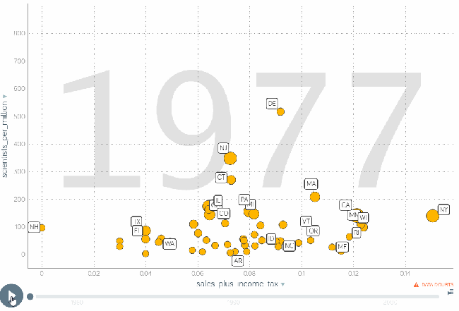
So does lowering taxes attract scientists? Yes, but not many. States that have higher taxes seem to be able to get more scientists. Why? I don’t know. I mean there are some high tax states that are doing really badly. There are many possible theories that would lead from high taxes to many scientists. California for example has a really strong network of universities. One thing I need to point out though before we make theories is that this phenomenon of high tax states having more scientists is a recent development. At the start of the observation, we don’t see this. I showed the animation above, but let me freeze frame the “scientists per million” on the first year, 1977:

In 1977 there is no clear upward trend. Maybe there is a really slight upward trend, but really if there is a trend here I would say that states that are in the middle of the pack do well. If you have low taxes you do badly, and if you have high taxes you do well, but not as well as the people in the middle. But there are also a few things misleading about this graph. Delaware for example had less than 600,000 inhabitants at the time. It’s easier to be an outlier in the “scientists per million inhabitants” category when you’re small. Also the X axis is misleading, because federal taxes are missing. The income tax rate in New Jersey in 1977 was actually higher than in California in 2003. You can kinda see that in the animation higher up where I plot the “total income tax.” It’s the animation where the bubbles bounce left and right a lot. The only conclusion I can draw from this is that in the 70s high tax states didn’t have such a clear lead over the other states as they did in 2003, so for some reason whatever benefit that you get from higher taxes really took off in those 26 years.
At this point I could try to make theories for why high tax states generated more top scientists from 1977 to 2003, but I’ll leave that for others. I set out to investigate the question whether lower taxes lead to more top scientists, and I disproved that theory. There is clearly no correlation, and therefore there is no causation. In fact the correlation seems to go the other way, but theories for why that is will have to wait for another time.
Conclusions
In conclusion what I found is that the states that are best at generating scientists tend to have higher taxes. Some of the top scientists move from the generating states to lower tax states, but not nearly enough to make up the difference.
So if you want top scientists in your state, should you lower taxes to attract scientists? Maybe, but you can probably get more if you can figure out what those states on the right, the ones with higher taxes, have done between 1977 and 2003. It seems like you can get literally ten times more top scientists from growing scientists in your own state (200 to 800 scientists per million inhabitants) than you can get from migration from other states. (40 to 80 scientists per million inhabitants)
Whether you decide to raise taxes to invest them in science funding, or if you decide to lower taxes to try to get people to migrate to your state, be careful: There are low tax states which didn’t manage to attract migration, and there are high tax states that didn’t manage to generate scientists. The situation is more complex, and it can’t be controlled through taxes alone.
For further reading I have this article, which claims that most science gets done by big corporations. Which would certainly explain why California and New York are doing so well, but it just begs the next question: Why are there so many big companies in Silicon Valley and New York City? Also here is a piece that claims that 76% of venture capital funding goes to California, New York and Massachusetts. I have no idea why those three states in particular, but it also seems relevant… And finally I work in computer science, a field where like half of the really big inventions came from governments or universities, (or government-funded research at universities) so that would be the clearest link between taxes and top scientists. I’m sure somebody has numbers on where most government funding for research goes, and we could correlate that with this database of top scientists.
But for now I end this investigation here and I thank you for reading this.
Appendix: Data and scripts
I exported the Gapminder graph and uploaded the file here. You have to extract that zip archive somewhere and then open index.html. This file is probably what you want if you just want to play around with the data and look for correlations. For example one fun analysis that I didn’t include above is “maybe the higher tax states have a higher GDP per person and because of that they have more scientists.” That is interesting because there is no correlation between tax and GDP, but there is correlation between taxes and scientists, and there is correlation between GDP and scientists. Meaning A correlates with B and B correlates with C, but A does not correlate with C.
If you want more data, the authors of the original paper have made their data available here. There is much, much more data in that dataset than what I included in the Gapminder export.
I used this R script to generate pictures from the data and to convert it for Gapminder. To run the R script you have to change the “base_folder” variable at the top of the file to point to where you extracted the data from the paper. Also, after running the script, you have to manually open the file “for_gapminder.csv” that the script writes to the data/ folder, and remove the first column in there. I did that using sublime text, but you can also remove it using LibreOffice Calc. There is probably also some way to do it in code. After you have removed the first column, you can open the file in Gapminder.

Fascinating article. Note that the early prominence (and later fall) of New Jersey should not be a big mystery: Bell Labs.
Thank you for a very nice analysis. It shows that you really have to understand the context to be able to draw good conclusions.
A very nice analysis. Thank you.
It shows that one really needs to understand the context in order to draw good conclusions.